How to Improve User Experience for Customers on a Self-Service Site
Let’s imagine for a second that you just launched the first ever self-service site for your company. You had enough of simple requests bogging down your agents as they piled into the ticket queue. After working through the weekend, there’s now enough content on the self-service site that you feel comfortable having customers use it. But… something’s missing and you can’t figure out what it is. A few weeks later, you look at your analytics and you see customers are visiting the site, but they aren’t staying for long.
Why?
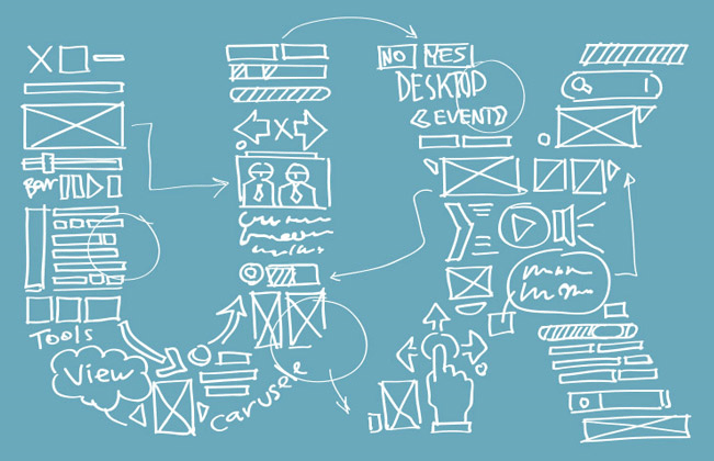
This is where User Experience, or UX, comes into play and can make a huge difference. UX is taking a step back and putting yourself in the shoes of your user (i.e. your customer) to understand how they experience your site. As the creator or manager of the customer self-service software, you likely know where everything is – that’s because you built it or work on the site daily. But what about a first-time visitor? UX plays a major role in turning that initial visit from an exercise in frustration into a satisfied customer answering their own question.
Here are four self-service user experience tips to consider when evaluating your self-service site…
1) Choose appropriate color schemes – Sometimes people just don’t feel like being on a website because the colors clash too much. Maybe the text is hard to read or it’s just visually unappealing. Either way, there is more to creating a visually impactful self-service site than picking colors at random. Sites such as Color Hunter can help you choose the appropriate complimentary colors for your site based on just a single hex code or image. You don’t need to be an art major to make a self-service site that’s easy on the eyes!
2) Make your menus compact and practical – When first launching a self-service site, a common mistake is trying to make too many things accessible on one page. The home page of the site can be a plethora of unorganized links and sub menus – and while it’s great (in theory) that there’s a link to everything – it’s very difficult for the user to find what they’re looking for. Instead, consider using flat hierarchical menus so customers can find information without feeling overwhelmed.
3) Add visual elements to your site – You might have great and helpful content on your self-service site, but after looking at the metrics you find out visitors still aren’t sticking around. If this is the case, it’s possible your site isn’t visually engaging enough. Consider adding screenshots or how-to images to self-service pages to cater to customers who learn in other ways besides reading text. Videos are also a great addition to self-service support sites if appropriate for your industry.
Want to know more? Click here to download our checklist on building a great customer support site and find out.
4) Recommend related content to visitors – Customers visit self-service sites because they are starting the process of looking for information, or they prefer to self-serve. However, their patience is limited and if they don’t find the right answer quickly they will leave the site altogether. This is where including recommendations to related topics can keep customers on the site longer and provide a much better user experience.
In short, user experience can have a direct impact on your self-service site and the feelings your customers have while visiting. To improve user experience for customers, make sure your site is practical by choosing color and menu schemes that will be appealing to your customers. From here, it’s important to add on-page elements to make your site more visual and interactive. Creating a good UX on your self-service site will only increase its usage, thus decreasing the total amount of support tickets your company receives.


